
I liked the site. The logo needed to catch up.
How I chose Core CK without throwing away the website I liked, and how that fits alongside the branding work for First Flip, DrawerSense and Mechanistic Health.

One visual language, from architecture to the adopted CK mark.AI-generated conceptual setting.
A fit problem, not a new website
The site stayed. The mark learned its language.
The page already had off-white surfaces, red cuts, large type and alpine architecture. The useful question was whether a CK mark could belong to that world.
CSS could not remove pixels baked into a file.
White boxes behind project logos exposed the first problem. The panel was tinted; the image itself was opaque. The repair had to happen in the export or in a deliberately matched image surface.
I wanted CK to feel designed for this page.
The precise, futuristic architecture of Atlas in Call of Duty: Advanced Warfare was already part of the site’s reference language. It guided geometry and restraint; it was not a request to put an Atlas A on the page.
Codex helped explore the directions and assemble the guide. I rejected generic options, asked to see the mark in context and selected Core CK. That is an AI-assisted design process under my direction, not a claim that I hand-drew every candidate.
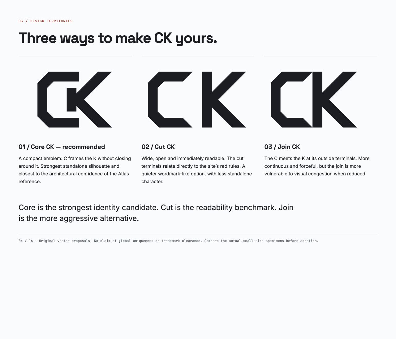
- Open C
- avoids a closed counter
- Framed K
- reads as one emblem
- Angular cuts
- echo the existing page
One drawing, checked where people meet it.
The full name stays beside the header mark, so visitors do not need to decode the initials. Large views expose the geometry; small views expose a cramped opening. Both themes and the real page expose integration problems.
- Header CALVIN KENNEDYMark and full name
- Footer Same source drawing
- Browser icon Separate tiny-size drawing
- Social card Default share image
I chose the mark because I liked how it held together in those applications. Whether other people remember it remains a separate question.
Three related projects do not need my personal site’s identity.
Putting the systems together makes their different roles visible. The boards below are design evidence. Their mockups and recommendations do not prove adoption, shipped products or customer results.
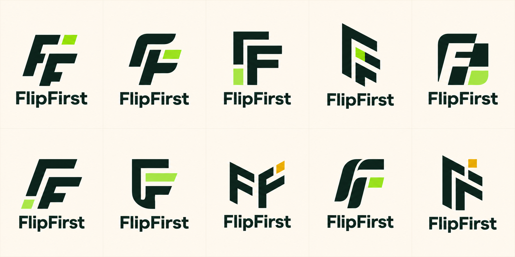
First Flip
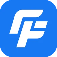
The exploration held the interlocking FF geometry steady while it compared forest and lime, blue and white, and a blue-lime hybrid. Blue and white became the selected direction. Familiar blue may help people place a marketplace product, but it may also evoke a much larger social brand. That needs testing.
See the current product site The board uses the earlier FlipFirst name.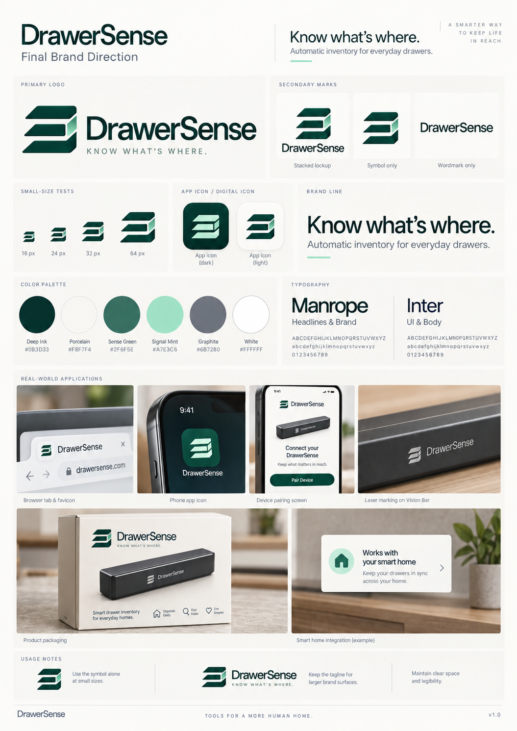

DrawerSense
The identity sits beside objects and storage because the product keeps a camera-based record of where an object was last seen. The board shows the three-drawer symbol, Manrope and Inter, green accents and warm neutrals. Its packaging, device screens and smart-home panel are design mockups, not shipped hardware or working integrations.
See the current product site An isolated symbol still needs a deliberate background or transparent export.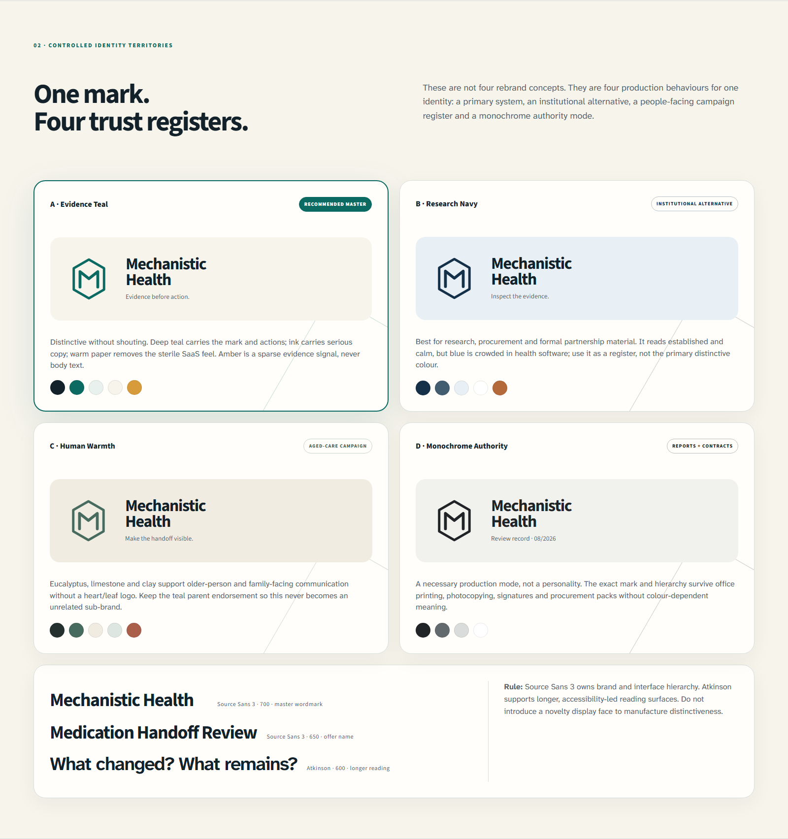

Mechanistic Health
The August 2026 exploration kept the existing hexagonal M while comparing teal, navy, eucalyptus and monochrome treatments. It also tested clearer type across icons, reading surfaces, documents and the company site. “Recommended master” is wording on that working sheet, not proof that every application was adopted. Appearance cannot establish what a health product does.
See the company site This work improved the system around a recognisable mark.A defect returns to the source that owns it.
- White boxRepair the exportThen check it on the real surface.
- Closed CUse the open or micro drawingThen recheck it at the failing size.
- Generic initialsReturn to the site constraintThen compare the mark in context.
Working now: Core CK is the selected identity for this site. The header, footer, browser icon and default social card share its source, with a small-size variant where needed.
Boundary: this is a design and implementation account. It is not customer validation, mark clearance or evidence of commercial performance.
The first clue was a white box behind a project logo. Then the same question reached my own initials: did the mark belong to the page around it?
The visual story above follows the actual decision. I kept the website’s direction, compared the CK options in context, chose Core CK and carried one source drawing into the places where it has to work.
The files are part of the evidence
The Core CK guide records the adopted geometry, spacing, colour roles and small-size version. The SVG asset pack contains the actual files, including the favicon drawing. The project brand notes compare First Flip, DrawerSense and Mechanistic Health without exposing the internal working documents.
Core CK is the identity I chose for this site. The choice records my preference and the implementation now in use. It does not establish customer recall, mark clearance or commercial performance.
Short notes on building AI agents in production.
One email when something worth sharing ships. No fluff, no daily cadence, no recycled growth-thread noise.
Primary use: site updates, governed AI workflow lessons, and major project writeups.